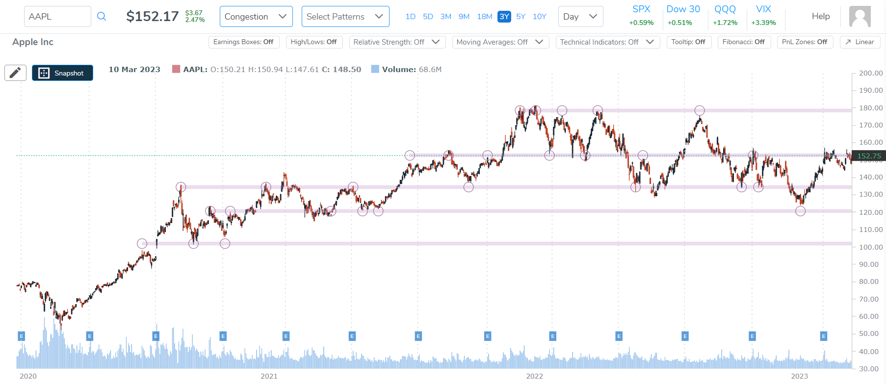
What are those purple horizontal lines with pink circles on the chart?
These are areas where there are patterns of congestion. Congestion (high volume) is demarked with a pink circle when it coincides with a local top or bottom.

If many of these points line up it means a lot of shareholders bought or sold at that level and the hypothesis for chartists is that those prices, especially if they repeat, become anchors for rallies or sell offs - "congestion points" which act as support or resistance.
You can think of this as an example: when you buy a stock and you see it top then drop and then bottom and then turn. Eventually we inherently make those mental notes and judge the stock on those values. If they repeatedly turn into tops or bottoms, more and more traders see it the same way and that's the psychology of a stock and why the chart is simply an expression of that.
It's those local tops and bottoms that create our purple congestion lines.